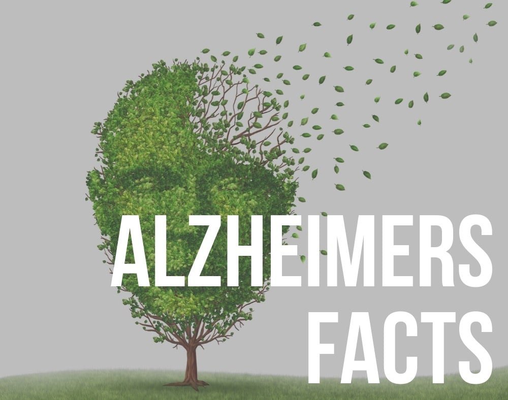
What colors do dementia patients prefer? There is no single color, or group of colors, that every person living with dementia will prefer.
Personal taste still matters. Someone who has always loved blue, green or red may continue to enjoy those colors after developing dementia.
What can change, however, is the way a person sees and distinguishes colors, objects and contrasts.
Research suggests that dementia can affect color discrimination, contrast sensitivity and other aspects of visual perception. This means that when choosing colors for a dementia-friendly home, visibility and contrast may be more important than trying to find one supposedly “best” color.
In this guide, we look at what research tells us about color and dementia, how different colors may be used, and some practical ways color can make everyday surroundings easier to understand.
Do People With Dementia See Colors Differently?
Yes, dementia can affect visual processing as well as memory and thinking.
A 2024 systematic review of visual function and cognitive impairment found that people with dementia performed worse than people without dementia on measures including contrast sensitivity and color vision.
Research has also found differences in the ability of people with Alzheimer’s disease to distinguish certain color combinations.
For example, one study found that people with Alzheimer’s disease were more accurate at distinguishing black-white and red-yellow combinations than blue-green combinations.
Importantly, however, being able to see or distinguish a color is not the same thing as preferring it.
Another study examining color discrimination and preferences in people with Alzheimer’s disease found that color discrimination could be affected while individual color preferences remained relatively stable.
This is one reason caregivers should not assume that every person with dementia suddenly prefers the same colors.
What Colors Do Dementia Patients Prefer? What Research Shows
There is not enough evidence to say that people with dementia universally prefer blue, green, red, yellow, orange, pink or any other particular color.
One study of color choice in people with Alzheimer’s disease and mild cognitive impairment found differences in the colors selected by participants. However, the researchers also acknowledged limitations surrounding the particular color test they used.
For everyday dementia care, a more useful approach is generally to consider:
- the person’s existing favorite colors
- whether important objects stand out clearly from their background
- good lighting
- strong contrast where something needs to be noticed
- avoiding confusing patterns and visual clutter
- whether the person responds positively or negatively to a particular color
These principles can be particularly useful when creating a dementia-friendly home.
Contrast May Matter More Than the Individual Color
For someone with dementia, the difference between two colors can sometimes be more important than the colors themselves.
The National Institute on Aging recommends using visual contrast in the home of a person with Alzheimer’s disease.
For example, it suggests making walls lighter than floors, using brightly colored signs or pictures to identify important rooms, and marking the edges of steps with brightly colored tape when needed.
Dementia-friendly design guidance also commonly recommends contrasting toilet seats, door handles, grab rails and other important objects with their surroundings.
The aim is simple: make important objects easier to find and understand.
How Different Colors Can Be Used in Dementia-Friendly Design
There is no need to avoid particular colors simply because someone has dementia. Instead, consider how each color works within the surrounding environment.
For caregivers asking what colors do dementia patients prefer, the most useful starting point is the person’s own preferences, together with strong contrast and good lighting.
Blue

Blue can remain an attractive and familiar color for someone who has always liked it.
However, some research suggests that people with Alzheimer’s disease may find certain blue-green color combinations harder to discriminate than strongly contrasting combinations.
This does not mean blue should be avoided.
Instead, avoid relying on subtle differences between similar shades of blue when something needs to be clearly visible.
For example, a blue object against another blue background may be difficult to identify, while a strongly contrasting object may be much easier to see.
Green

Green is commonly used in homes and natural environments and may be familiar and pleasant to many people.
As with blue, the important issue is usually not whether green is “good” or “bad” for dementia.
Instead, consider whether there is enough contrast between the green object and its surroundings.
A green sign placed against a similar green wall, for example, may be much harder to identify than one that clearly contrasts with its background.
Red

Red can provide strong visual contrast when used against a light or very different background.
The National Institute on Aging, for example, recommends clearly identifying hot-water faucets with red and cold-water faucets with blue, together with written labels where appropriate.
Red may therefore be useful when you want an important object or cue to be noticeable.
However, there is not good evidence that every person with dementia prefers red or that red will reliably improve appetite or behavior.
Yellow
Yellow can be highly visible when it contrasts strongly with its surroundings.
Research into color discrimination in Alzheimer’s disease has found that red-yellow combinations may sometimes be easier to distinguish than blue-green combinations.
That finding relates to visual discrimination rather than personal preference, so it should not be interpreted to mean that everyone with dementia prefers yellow.
It may nevertheless be useful as part of a clearly contrasting sign, object or visual cue.
Orange

Orange is another highly visible color when placed against a strongly contrasting background.
If someone has always liked orange, there is no reason that dementia alone should mean removing it from their surroundings.
Favorite colors can be incorporated into clothing, cushions, artwork and other familiar possessions to help a home continue to feel personal rather than institutional.
Pink

Pink may also be enjoyable for people who have always liked the color.
There have been claims that certain shades of pink can reduce aggression or produce a calming effect. However, there is not strong enough dementia-specific evidence to recommend pink as a treatment for aggression associated with dementia.
If someone appears comfortable with a particular color, it can certainly remain part of their surroundings.
Using Color Around the Home
Color can be particularly useful when it helps important objects stand out.
The Alzheimer’s Society dementia-friendly environment guidance recommends creating clear contrast around signs, toilets and other important features.
Practical examples can include:
- a toilet seat that contrasts clearly with the toilet and surrounding floor
- grab rails that contrast with the wall
- door handles that contrast with doors
- easy-to-read signs that contrast with the surface behind them
- furniture that is easy to distinguish from walls and flooring
- plain surfaces rather than complicated patterns
- good, even lighting without strong glare or deep shadows
At the same time, avoid creating unnecessary visual confusion.
Bold patterns, highly reflective flooring and sudden changes in flooring can sometimes be difficult for a person experiencing changes in visual perception.
What About Plates and Food?
Color can also be useful at mealtimes.
The main principle is again contrast rather than one particular “dementia color.”
If pale food is placed on a similarly pale plate, it may be more difficult to distinguish.
A plate that clearly contrasts with both the food and the table may make the meal easier to see.
The same principle applies to cups, cutlery and other dining items.
If someone is having difficulty eating, however, do not assume the problem is simply the color of the plate. Changes in appetite or eating can have many causes. Our guide to why people with dementia may stop eating explains these in more detail.
Personal Preference Still Matters
Perhaps the most important answer to the question “what colors do dementia patients prefer?” is that people with dementia remain individuals.
Someone who loved a particular color before developing dementia may continue to enjoy it.
Favorite colors can be incorporated into:
- clothing
- bedding
- artwork
- cushions and furnishings
- personal possessions
- signs and visual cues where appropriate
Watch how the person responds.
If a particular color or combination appears confusing or uncomfortable, try something different. If it is familiar and enjoyable, there is usually no reason to remove it merely because the person has dementia.
Closing Remarks
There is no scientifically established list of colors that every person with dementia prefers.
Dementia and normal aging can affect color discrimination, contrast sensitivity and other aspects of visual processing. Because of this, contrast, lighting and visibility are often more important than selecting one supposedly ideal color.
Use strong contrast where important objects need to stand out, avoid unnecessary visual clutter and keep the person’s own preferences at the center of any changes.
Ultimately, dementia-friendly design should help the person understand and use their surroundings while still allowing their home to look and feel familiar to them.
References and Further Reading
Impaired Color Discrimination in Alzheimer Disease Dementia.
National Institute on Aging: Home Safety Checklist for Alzheimer’s Disease.
Alzheimer’s Society: Dementia-Friendly Environment Checklist.